Pages

Showing posts with label comparison. Show all posts

Sunday, August 10, 2014

Sunday Similarities: Minty Teal Cremes


Hello again!  I've got a full Sunday Similarities post for you guys today so let's get a-movin'!  Mint remains a popular color choice no matter what the season and since I have about a billion of them in my stash, I decided to swatch a few and compare them for you.


These mints are in the teal family and are all cremes.  I'm comparing 4 polishes in this post: from left to right in the photo above are Sinful Colors Teal the End, NYC Tudor City Teal, Sally Hansen Triple Shine Dive In, and Sinful Colors Open Seas.  
 

As you can see,  Open Seas and Tudor City Teal have a bit more green and grey to them than Dive In and Teal the End, which are pretty much dupes.  Of the 4, Tudor City Teal has the sheerest formula, requiring 4 coats to get the opacity shown here.  Each of the others are shown in 2 coats here with no top coat on any of them.  

Do you need each of these polishes in your life?  Probably not, unless you're a nut like me ;)  Obviously, Teal the End and Dive In may be redundant, but Open Seas and Tudor City Teal differ by a shade or two.  I don't think Open Seas is still available in stores, being from a couple of seasons ago but I just picked up Teal the End for $1.99 at Walgreen's last week.  Tudor City Teal is available anywhere NYC is sold for $0.99 a bottle on average and Dive In tops the price list at around $4.99 wherever you find Sally Hansen products.

I hope you enjoyed this post and thanks so much for reading!

Sunday, August 3, 2014

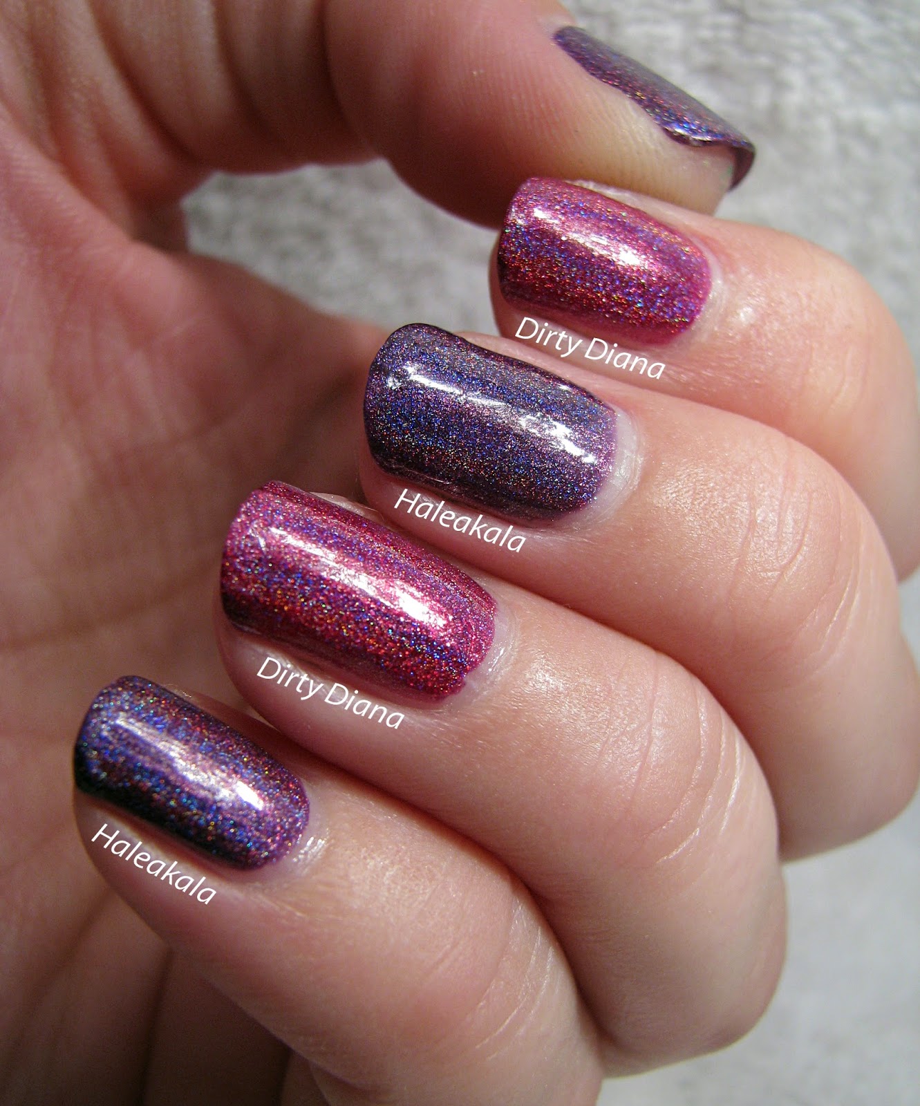
Sunday Similarities: Elevation Polish Haleakala & Colors by Llarowe Dirty Diana


Hey there, folks!  The other day whilst perusing Facebook, I saw Manicure Addict's swatch of Elevation Polish's Haleakala and immediately fell in love.  I jumped right over to Elevation's site and they had it in stock.  Because of unbelievably fast shipping, I received my bottle yesterday!  When I opened the package, my first thought was that Haleakala reminded me quite a bit of Colors by Llarowe's Dirty Diana.  So I figured it would make for a great Sunday Similarities post!


At first glance, you can tell just from the bottles that these ladies are not dupes.  But I really wanted to compare them on the nail so I swatched them both.


As you can see on the nail, there are some obvious differences.  Haleakala is much more purple whereas Dirty Diana is a vibrant pink.  Aside from the color, however, these two share a knock-your-socks-off linear holographic effect and a perfect formula!  I'm showing two coats of each here with no top coat. 


Since these are not really dupes at all, I highly suggest both or either for your collection.  Haleakala is currently available on Elevation's site for $12.50 for a full size bottle and Llarowe does have Dirty Diana up on their page as I write this, but only one full size bottle left at $12.  I do believe mention has been made of Llarowe re-releasing the Michael Jackson tribute collection, of which Dirty Diana is part, so don't despair if you miss it this time!

As always, thanks so much for reading and I hope you enjoyed the post!

Sunday, June 15, 2014

Sunday Similarities: My Floam went Kaboom and now I'm Flipping Out Hard!

*Nothing to disclose*

Hello everyone!  I'm so excited about today's post because it involves the nabbing of my #2 lemming of all time (#1 being Clarins 230 but short of a miracle or a lottery win, that shall remain a dream)!  I can't tell you what it is about Floam by Nail Venturous that caused me to jones so badly for it, but I've searched high and low for that little bottle with the yellow label.  I even bought it from a blog sale about a year ago, waited for three weeks, only to find out it had been lost in the mail.  This was a hard lesson I learned about international shipping :(  But my story has a happy ending because I found another blog sale (here in the States) and in that blog sale, I found another little bottle with a yellow label (for only $5 no less!) and this time, USPS did not fail me!  Thursday afternoon I unlocked my mailbox and there, to the tune of a choir of angels accompanied by rays of sunshine from Heaven itself, was my very own bottle of Floam!!  I know this seems dramatic, but as you're all polish people, I know you understand ;)


The very first thing I decided to do with my bottle of Floam (after I did a happy jig whilst holding it above my head in a triumphant manner) was a comparison post.  In my quest for Floam, I have tried several alleged dupes and am thrilled that I can finally compare them to the real deal!  Nail Pattern Boldness Flipping Out Hard and Salon Perfect Kaboom were two polishes that I picked up in hopes of quelling my Floam craving so I figured they'd make a great Sunday Similarities post!
 

I started with two coats of Sinful Colors Jungle Trail and then used two coats of each comparison polish; Floam on my index and pinky, Kaboom on my middle, and Flipping Out Hard on my ring finger.   I didn't use any top coat for these photos because each of these polishes purposely uses matte glitters.  That said, they do all look lovely with a top coat and you may prefer them with it because they will dry with some texture without it.  Flipping Out Hard is obviously the odd man out for color, having much more yellow and green glitters than the blue.  FOH is the most densely glittered polish of the bunch and I probably could have only used one coat with a little dabbing.  I have to say that as far as color and density go, Kaboom is pretty much a bang on dupe for Floam.  In the bottle, Floam comes off as a bit more blue but on the nail, that difference is less pronounced.  Kaboom is actually even a bit more dense in the glitter department than Floam.
 

If you'd like to purchase any of these beauties for yourselves, here's the low down.  Salon Perfect Kaboom can still be found in Walmart stores.  It retails for around $4 for a full size 14ml bottle, by far the most economical of the bunch.  Flipping Out Hard is available on the Nail Pattern Boldness site, retailing for $9 for a full size 15ml bottle.  Though not really a dupe for Floam, FOH is a gorgeous polish in its own right.  NPB just does a great polish, I have a couple and have yet to be disappointed! 

That brings us back to Floam which as you might expect is a little more difficult to get a hold of.  Ninja Polish, which took over Floam from Nail Venturous, is currently on hiatus.  I do not know when (or even if) she'll begin taking orders again. Your best bet is to stalk blog sales or Ebay, like I did.  I've seen Floam listed any where from $5 to $45 for the full size 15ml bottle.  Kaboom is by far the best dupe I've seen, so if you're less patient than I it's definitely a good option to get this look.  Especially with Ninja Polish being closed at the moment, I imagine Floam will become more difficult to find.

Thanks so much for reading, folks!  I hope you enjoyed the post and that it was helpful :)

Sunday, June 8, 2014

Sunday Similarities: Zoya Solange & Sinful Colors Face the Facets


Hello, hello!  It's time for another installment of Sunday Similarities!  If you're new to my blog, this is a segment where I compare similar polish shades in an effort to make your polish buying decisions easier.  I went on a Sinful Colors buying binge last week, with Walgreen's $0.99 SC sale I couldn't resist!  I hadn't had a chance to try out their texture polishes yet, and with three new ones in their Color Destination displays it seemed like a good time to give them a shot!


The only textures I've tried that I've really enjoyed are the Zoya PixieDusts.  But I thought for 99 cents, I couldn't go too wrong with Sinful Colors Face the Facets.  When I got FTF home, I realized it reminded me of Zoya's Solange so it was the perfect comparison for today's post!


I applied two coats of each polish, Solange on my index and ring fingers, FTF on my thumb, middle, and pinky.  As you can see there is a little color difference.  Solange is more of a true gold where FTF has a bright yellow finish.  The color of FTF is right on trend for summer, very bright and cheerful.


These polishes are similar in application and opacity.  The texture is also very similar.  FTF does appear to have some darker glitter pieces, you can see one in the shot above on the left side of the nail.  I don't think it's a big deal, but I thought it was worth mentioning.


And here's how they look with one coat of Seche Vite on top.  The beauty of the PixieDusts is their versatility.  You can wear them as intended, with the texture, or you can top coat them and that gorgeous sparkle becomes even more pronounced.  I have to say, I'm fairly impressed with Sinful Colors' take on texture.  They've done a great job here and I'm sad that I didn't grab the other two textures from the Color Destination display.  I'm hoping that they'll still be there the next time I run over to Walgreen's!

To sum up, if you like the look of Solange but don't feel like forking over the $10 for her, I think you'd be just as pleased with the Sinful Colors almost-dupe Face the Facets, for $1.99 (or $0.99 if you score a sale!).

I hope you enjoyed this post and thanks so much for reading!

Sunday, May 25, 2014

Sunday Similarities: Green Jellies, Wet n Wild Contact High & Sinful Colors Irish Green


Hello everyone!  Happy Memorial Day to my U.S. followers!  I want to express my heartfelt thanks to those folks (and their families) who have served in the military.  It's a great sacrifice they've given for this country and I'm grateful to those who give their time, and too often life or limb, to serve and protect.

 I've got a quick Sunday Similarities post for you all today with a couple of bright green jelly polishes.  Whilst strolling through my local Walgreens the other day, I noticed the Wet n Wild Summer 2014 Limited Edition All Access Beauty Megalast display.  They have introduced a rainbow of bright colors for the summer and I picked up a couple including Contact High which, when I got it home, I realized looks a lot like Sinful Colors Irish Green.  I figured a comparison post was in order :)


In the bottle, you can see the obvious similarity.  Both are bright, grassy green jelly polishes.  At first glance, I thought they were exact dupes.
 

But when I applied 4 coats of each, I discovered that Contact High is a few shades darker than Irish Green.  Irish Green also has a bit more yellow to it.  They are very similar in formula, sheerness, and finish (no top coat in these photos).  Contact High is a Limited Edition and Irish Green tends to show up around St. Patrick's Day, so if one or the other isn't available to you, I don't think you HAVE to have both.  But at $1.99 each?  Too good of a deal to pass up!

Thanks so much for reading!

Sunday, May 18, 2014

Sunday Similairities: Orange Linear Holographics

*Nothing to disclose*

Hey there!  Who's excited to see a Sunday Similarities post?  I certainly am!  It's been ages since I've done one, but thanks to my friend Liz from A Mani Maniac, I have a pretty sweet set to compare for you today! 


The polishes I'm comparing today are all orange-toned linear holographics.  From left to right in the photo above are: Literary Lacquers More Like Fire Than Light, Studio M's Sunrise Canyon, and LynBDesigns Am I Ginger?.  Both the Literary Lacquers and the Studio M (an affiliate of ColorClub sold only at Mejier grocery stores, I believe) were gifted to me by Liz and I'm ever so grateful because they're both gorgeous!  Let's take a peek at how these gals stack up against each other, shall we?


As you can see, I'm wearing More Like Fire Than Light on my index and pinky nails, Sunrise Canyon on my middle nail, and Am I Ginger? on my ring finger.  Sunrise Canyon is very obviously the odd girl out here, with a much lighter orange tone.  It's a very hard to describe color as it almost has a metallic pink color to it in certain lights.  MLFTL and AIG? are much more similar to each other and practically dupes, with AIG? being just a shade or two darker orange.  MLFTL has a bit more yellow to it as well.  All of these polishes have a strong linear holographic effect which shows in most light; most prominently of course, in sunlight.


Sunrise Canyon is fully opaque in 2 coats and that's what I'm showing here.  AIG? took 3 coats for opacity and MLFTL took 4 thin coats.  I did not apply a top coat for these photos so you can see the actual finish of each polish. All the formulas are lovely, smooth with no application issues.  Does one need both AIG? and MLFTL?  Probably not since they are so similar, but I like to support my favorite indie brands and these two definitely fit that category!

If you are lucky enough to live in a area serviced by Mejier, you can find Sunrise Canyon and other Studio M nail polishes for $2.99 each.  Am I Ginger? is currently stocked over on LynBDesigns Etsy store and is $10 for a full-size bottle.  More Like Fire Than Light is available on Literary Lacquers Etsy store, also for $10 for a full-size, 15ml bottle.  You may also want to keep an eye on the Facebook pages for LynBDesigns and Literary Lacquers, as you'll find updated info on restocks, new products, sales and other fun stuff for each brand there.

Don't forget to enter my latest giveaway here!  I hope you enjoyed the post and thanks so much for reading!
Monday, January 20, 2014

Belated Sunday Similarities: Berry/Wine Holographics

*All products purchased by me*

Hey there!  I'm a little late with my Sunday Similarities post, but I knew I really wanted to get this one up!  I've been reorganizing my stash over the last few days (read: moving my polish around into piles and then letting it sit until I figure out what to do with it) and as I was digging through my untrieds bin, I came across LynBDesigns' Nightmare Revisited.  I thought it looked pretty similar in the bottle to both I Love Nail Polish's Molly and The Devil Wears Polish's A Nice Chianti.  What do you guys think?


As you can see, each of these lovely ladies is a berry or wine tinted holographic.  I held these bottles up to show my bf and he laughed at me for having 3 of exactly the same color polishes by 3 different makers.  However, I urge you to look at the following photo and tell me who's laughing now? 


Nightmare Revisited is actually much more pink, verging on a hot pink, on the nail whereas A Nice Chianti and Molly are both deeper in color, closer to a raspberry or wine color.  A Nice Chianti has the most holographic punch of the 3 (I would expect nothing less of The Devil Wears Polish) but all of them will knock you out in sunlight!  Nightmare Revisited is also the sheerest of the bunch, showing at 3 coats here.  A Nice Chianti was fully opaque in 2 coats and Molly was practically a one coater.  A Nice Chianti and Molly are similar but Molly is 2 to 3 shades deeper than A Nice Chianti. They are all, of course, gorgeous and I'm so happy to own them all!

If you would like to snag any of these beauties, they are all currently available on their makers websites.  Nightmare Revisited retails for $10 for a full size 15ml bottle, Molly is also $10 for ILNP's full size 12ml bottles, and A Nice Chianti comes in 13.2ml full size bottles for $12 and 5ml mini bottles for $5.75.

*All products purchased by me*

I also urge you to follow each of these fabulous makers on Facebook as they all share fantastic manicures, new release info, and tons of other things you'll want to keep abreast of!  You can like The Devil Wears Polish here, LynBDesigns here, and I Love Nail Polish here.

Thank you so much for reading!

Sunday, November 24, 2013

Sunday Similarities: For the Twill of It, Interstellar Towel, and chic reloaded


Hi all!  How'd your weekends wrap up?  Good, I hope!  I caught an afternoon showing of Catching Fire with some good friends and enjoyed it thoroughly...both the movie and the company.  It helped soothe a bit of the loss my Wildcats suffered yesterday.  Ah well, can't win 'em all!  Anyway, I missed last Sunday's Similarities post, so I knew I had to get one up today.  I decided to compare Essie's For the Twill of It, Carpe Noctem Cosmetics' Interstellar Towel, and Essence's chic reloaded.


 From left to right: Essie For the Twill of It, Carpe Noctem Cosmetics Insterstellar Towel, and Essence chic reloaded

Each of these polishes are purple/grey/olive duochromes.  Obviously, this is a color that I like...since I own three lol  But they do look a bit different on the nail.


I'm showing 2 coats of For the Twill of It on my index finger, 4 coats of Interstellar Towel on my middle and ring fingers, and then 2 coats of chic reloaded on my pinky.  Both FtToI and cr are more opaque than IT but the formulas on all three were great.  IT is definitely the sheerest of the three and shows up more green in this light.  In ambient room light, it actually looks more purple than the other two so it's interesting that the green shows up more prominently here.  I think FtToI and cr are pretty much dupes...cr may be a touch deeper, but if you own one, you probably don't need the other.  IT, however, looks different enough that you may want to grab it in addition to one of the others.

All of these polishes are pretty easy to get ahold of.  Both FtToI and cr can probably still be purchased at Ulta where I got mine.  Essie definitely still has FtToI online.   The Essie will run you around $8-9 and the Essence is around $2.  Carpe Noctem is currently listing IT in 3 sizes on Etsy; $4 for 6ml, $7 for 12ml, and $10 for 15ml (incidentally, I LOVE that Emily offers 3 sizes of polish...I hope she continues with it!).

Thanks so much for reading!

Sunday, November 10, 2013

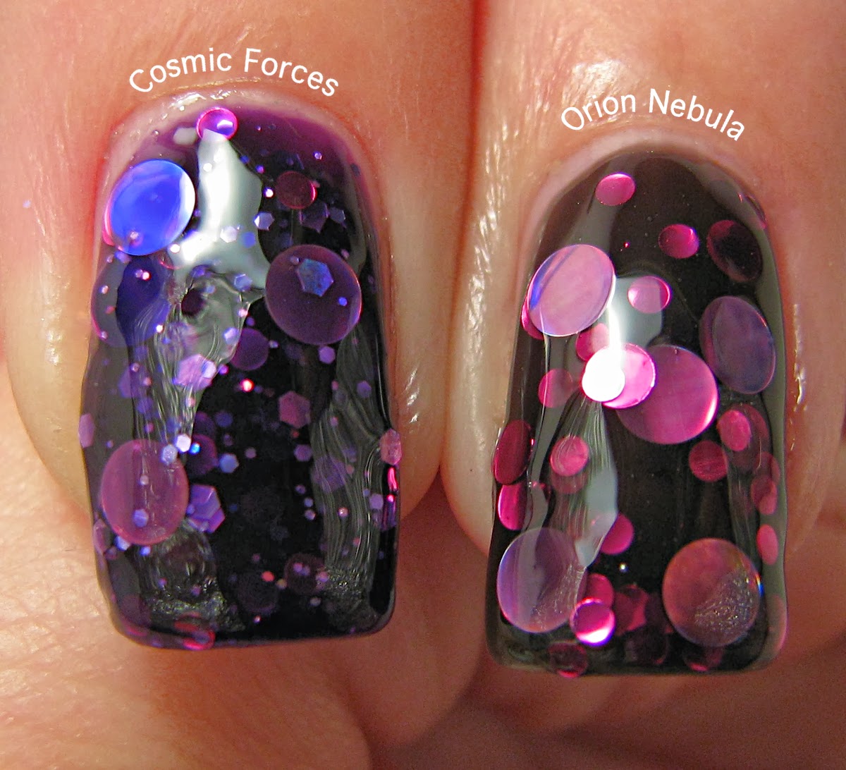
Sunday Similarities: Cosmic Forces & Orion Nebula


Hi everyone!  I hope you've all had a great weekend!  I got my carpet cleaned so I can finally move into my old roommate's bedroom...I'll have a door of my very own!  Woot :)  It's been a rough few days, so I'm thrilled to have something to look forward to.  This is going to be a busy, busy week for Over the Top Coat as well.  I hope you're all prepared for some loveliness soon!  As today is Sunday, I've got another Sunday Similarities comparison post for you.  This one includes one of my all-time favorite polishes, so let's get to it!


If you've been reading my blog for very long, you'll know I'm a sucker for circle glitter.  Whilst gazing in adoration at my collection the other day, my eyes lit upon these two bottles sitting side by side.  On the left is Emily de Molly's Cosmic Forces (the aforementioned all-time favorite) and to the right, Different Dimension's Orion Nebula.  While I know they do look different in the bottle, I felt they were similar enough to slap a few coats on and do a comparison.  Especially since ON was in my "untried" folder...I'm glad to finally move her into a new category!


I'm wearing 4 coats of Orion Nebula on my index and ring fingers and 3 coats of Cosmic Forces on my middle and pinky fingers.  Obviously, ON is a bit more sheer than CF.  CF's base is a dark purple jelly where ON has a sheer black jelly base.  The glitter mix in CF includes more sizes of glitters and also has hexes, ON has 2 sizes of fuchsia circle glitter and the large holographic lavender dots. 
 

Both of these polishes are stunning!  I absolutely am glad to have both, they're definitely not dupes.  Now for the details!  Both of these polishes are still available for sale, although ON will probably be easier to get ahold of.  CF is available during restocks of Emily de Molly on Llarowe if you've got quick reflexes and a lot of patience.  A 12ml bottle will cost you $13 and is, I believe, worth every penny.  It is currently out of stock as I write this, but EdM still makes it.  If you're lucky enough to live in Australia or to have an Aussie nail polish fairy, you can find CF on EdM's etsy site, but she currently does not ship to the States.  For more info on restocks, you can sign up for an account on Llarowe and you'll get alerts or follow her on facebook for the most up to date info!  ON is currently available on Different Dimension's etsy site for $8.50 for a 15ml bottle, also worth the dough!  For updates on DD products, sales and such, follow her on facebook as well :)

I hope you all enjoyed the post today and that you're liking the comparisons in general!  As always, I'd love any feedback or suggestions you'd like to leave and thank you so much for reading!

Thursday, September 12, 2013

I Love Nail Polish: Birefringence Review and Comparison


Oh. Em. Gee., guys.  Seriously, I'm so excited I can't even greet you all properly!  A few weeks ago, I joined in the absolute craziness that was I Love Nail Polish's Ultra Chrome pre-order.  After a frustrating website experience (and I understand that they've fixed things up over there to make it all much smoother...none of the web site people ever seem to understand how nutty we nail folk are about our polish!) and an almost unbearable wait (and a shout out to Raquel from Sunshine Nails who made the wait more bearable by sharing the pain lol), my Ultra Chromes arrived today!  I could not wait to try them out, but I couldn't decide on which I wanted to use first because they're all so beautiful.  So, I asked my bf to pick.  After a little deliberation (the bf takes his polish-picking duties seriously), he handed me Birefringence.


Now I have to apologize that my photography skills aren't enough to give you guys every color shift this lovely has.  I did my best and I hope you'll get an idea of how magical this polish is.  Birefringence (which means "double refraction" according to Google, rather fitting) is a shifting fantasy, teal to sapphire to amethyst to fuschia, with a touch of gold around the edges.


In addition to the sensational shiftiness, Birefringence and the other Ultra Chromes are opaque by themselves, no undies, in 2 coats!  Most other duo/multichromes require a dark base to show off their shifting powers.  Not so with these beauties.  I did use 3 coats in these photos, just because I could.  The first coat goes down a little thin and you'll want to make sure each coat is completely dry or you'll probably bald and drag a bit, but the second coat covered completely!  Color me impressed!


After staring at the gloriousness of Birefringence for a bit, I realized it reminded me of my precious bottle of Sally Hansen's Nail Prisms in Turquoise Opal.  I was curious to see how they'd compare side by side.  The following photos are the result of that experiment.


Ok, ok, I know the font is tiny, so I'll give you a run-down of what's happening here.  My index finger and thumb are sporting the aforementioned 3 coats of Birefringence.  My middle finger has 5 (!) coats of Turquoise Opal.  Then my ring and pinky fingers have 2 coats of Birefringence and Turquoise Opal respectively, over 2 coats of Deborah Lippmann's Edge of Glory in black.  I had to use a flash to get the difference to show up here.  In many lights and from most angles, they look the same.  However, TO is more green in ambient light whereas Birefringence shows more blue.  The shift is remarkably similar.  Since TO is discontinued and the prices I've seen on Ebay make Lynnderella's look like a steal (hello $40!), Birefringence seems very reasonable at $12.50 for a 12ml bottle.  It might be a good substitute for those not willing to take out a second mortgage for TO. (I bought my bottle a million years ago on CLEARANCE.  Seriously, if I'd known then what I know now, I'd have cleaned them out and be making bank on Ebay myself lol)

I decided to try something I've never done before.  I'd read that photographing your holos and multichromes underwater really make the colors dance.  I figured now was as good a time as any to test it.


Dance, baby, dance!  Holy wow!  And that's what I'll leave you all with this evening.  You're welcome ;)

Thanks so much for reading!